- WoW Dragonflight
- Destiny 2
- WoW Classic
- Helldivers 2
- Last Epoch
- Diablo 4
- WoW WotLK
- Apex Legends
- Battlefield 2042
- Brawl Stars
- Black Desert
- CoD Warzone 2
- CoD Modern Warfare 2
- CoD Mobile
- CoD Cold War
- CoD Vanguard
- CoD Modern Warfare 3
- CS 2
- CS:GO
- Cyberpunk 2077
- Dead by Daylight
- Dota 2
- Diablo Immortal
- Diablo III
- Diablo II: Resurrected
- Elden Ring
- Escape from Tarkov
- FFXIV
- Fortnite
- FC 24
- FIFA 23
- Genshin Impact
- Halo Infinite
- Hearthstone
- League of Legends
- Lost Ark
- Monster Hunter
- New World
- Overwatch 2
- Path of Exile
- PUBG Mobile
- Remnant 2
- TESO
- Tower of Fantasy
- Valorant
- Warcraft Rumble
- Warframe
- World of Tanks
- WoW Cataclysm
- WoW Gold
- WoW TBC
WoW Boost Awaits in 30 Mins – Crush Raids, Speedrun M+ and Soar in PVP
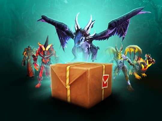
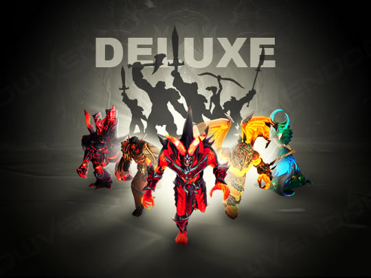
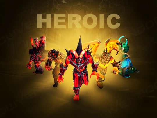
Popular Services


Package Deals


Couldn't Find a Service? Request a Custom Order
Send us a service request, and we'll look for ways to make it happen.
Subscribe to Get 10% OFF
Subscribe to our Weekly Newsletter and grab a 10% discount. Take part in exclusive sales and giveaways.
Sign Up to Get 7% OFF
Get a 7% discount for creating an account. View order details, access your payment history, and speed up the checkout.
Latest WoW Dragonflight Guides & News
See all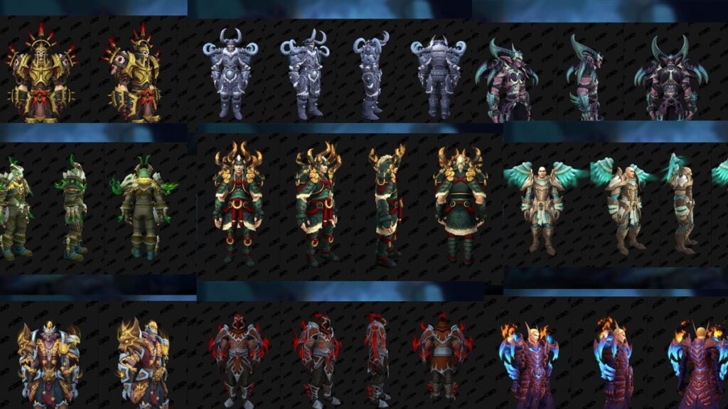
Greetings, fellow adventurer! Welcome to our official WoW Boost page dedicated to World of Warcraft boosting services!
Here you can discover our vast collection of WoW paid services to enhance your gaming experience on US servers. We are thrilled to have you here, and we cannot wait to begin this exciting adventure together. But before we get to it, allow us to share a glimpse into who we are and what we stand for at WowVendor.
Who We Are and What We Do
WowVendor is a team of avid gamers, just like you. We love this game with all our hearts, and that’s why we created a platform where everyone can access reliable WoW boosting services at the best price on the market.
While gaming is typically an enjoyable and exciting experience, there are moments when certain in-game activities can become challenging or downright tedious. These activities often revolve around hard-to-get rewards or the requirements you have to meet to unlock or complete specific content. At WowVendor, our main objective is to assist players in attaining their gaming goals without putting in much effort and wasting their precious time. If you wish to avoid the repetitive grind and get everything you want in your favorite game, then you’ve come to the right place.
Having been operating since 2014, WowVendor is an established WoW boosting service provider. Over the years, we have gained a lot of satisfied customers who continuously choose to play with us and generously share their positive reviews. We are honored to have earned such loyalty and we continue to strive for excellence, fully committed to three key principles that guide our every action:
Trust
Building trust is fundamental for any relationship, be it personal or professional. Our customers place their trust in us when they buy WoW carries and other boosting services, knowing they will receive the desired results in the shortest time possible. We highly value this trust and work hard to ensure customer satisfaction with our utmost dedication and result-driven approach.
Comfort
Feeling comfortable is essential, even as you dive into the content of your favorite game alongside a team of professional players. At WowVendor, we put in extra work to make sure that every player who joins us experiences nothing but positive emotions throughout the entire boosting process. After all, video games are all about having fun and bringing joy to people’s lives.
When you buy WoW boost and carry deals from us, you can rest assured that you won’t have to endure long queues, time-consuming wipes, or tedious grinding sessions. Customer comfort is our top priority here at WowVendor. We aim at making your playtime enjoyable and relaxing, aiding you in achieving all your desired goals along the way.
However, making sure you feel at ease doesn’t solely extend to in-game experiences. We also strive to make both boosting and purchasing effortless for all our customers. That’s why we packed our website with intuitive UI to make it easy to navigate so that you don’t encounter any difficulties in finding the information you seek or placing an order to buy carry WoW services.
Fair Pricing
We are passionate about World of Warcraft and keen on sharing our love for the game with like-minded players. We want to make WoW boosting accessible to everyone, and that’s why you’ll find our prices to be incredibly affordable. With WowVendor, you can start playing WoW the way you’ve always wanted to and enjoy the game to the fullest without breaking the bank.
Honoring the Legacy of ElitistJerks.com
As we continue to evolve and expand our services at WowVendor, we proudly uphold the legacy of ElitistJerks (EJ), a name synonymous with excellence in the World of Warcraft community. With the recent acquisition and integration of ElitistJerks.com into our platform, we aim to blend EJ’s analytical rigor and deep understanding of game mechanics with our comprehensive boosting services. ElitistJerks.com was renowned for its detailed discussions, guides, and strategies, crafted by some of the most knowledgeable players in the WoW community. By bringing the essence of EJ into WowVendor, we not only preserve the rich history and expertise of ElitistJerks but also commit to elevating the quality and depth of our services. Our team is inspired by the dedication of EJ to optimizing gameplay and performance, ensuring that every player who chooses WowVendor experiences the pinnacle of gaming excellence, backed by a legacy that has shaped the way we play and engage with World of Warcraft today.
What Kind of WoW Boosting Services You Can Order
World of Warcraft is a massive game with a multitude of activities for players to enjoy in the vast realms of Azeroth and beyond. With our WoW boosting services, we aim to cover all aspects of the game to make sure you always find just the right WoW boost for your needs.
Raiding Content
Raiding stands as one of the most formidable and time-intensive PvE challenges in many MMORPGs, including World of Warcraft. Conquering these high-level instances demands not only top-notch gear but also a significant investment of time and effort. Unfortunately, the grind can easily become tiresome and repetitive, as the desired items may not drop on your first try.
When you buy WoW services from WowVendor, beating raids becomes much easier and a lot less exhausting. Recognizing the importance of raiding within the game, we have you covered with an extensive range of Warcraft carries tailored specifically for this field of content.
For our raid boosting offers, you can select any difficulty you need, be it Normal, Heroic, or Mythic. Our professional boosters have all the necessary skills and experience to navigate any instance in the game, no matter how tough it is. Also, when you buy WoW carry and boost runs, we do not restrict you to a particular class or spec, as our team always adapts to your character and playstyle.
If you want to get a World of Warcraft boost but can’t or prefer not to play yourself, you can treat yourself to an account-sharing boost. While you relax at home, hang out with friends, or attend to other important real-life matters, our best raiders will tirelessly farm powerful items and coveted mounts for your character. Opting for a self-play WoW service, you will have the chance to team up with top-tier Warcraft players and go raiding side by side with them, absolutely sure that your hired teammates know all in-raid mechanics and boss strategies to guarantee fast, wipe-less completions.
With each new raid release, our boosters delve into it right away to learn the mechanics and gain valuable practice. Dedicated to providing exceptional WoW services, we always make sure that our boosters are up-to-date with the content and fully prepared to tackle any challenge. As soon as a raid is open, we are ready to help you beat it.
PvP Activities
Player-versus-Player (PvP) content has always played a significant role in various MMORPG projects, and World of Warcraft is certainly no exception. Many players enjoy testing and honing their skills through thrilling Arena battles, and while playing PvP matches casually is sheer fun, climbing the ranking ladder can prove to be quite challenging. That’s why, at times, it’s more convenient to opt for WoW boost services.
Our PvP-related WoW services encompass virtually all aspects of the mode. Looking to boost your Battlegrounds rating or secure more RBG wins? Consider it done. Prefer engaging in 2×2 or 3×3 Arena battles but want to compete in higher-ranking brackets? No problem whatsoever — we’ll boost your Arena rating to the desired level in no time. Want to enhance your collection with rare PvP achievements and WoW mounts? We have just the right WoW boost for that as well!
If you don’t want to engage in battles against other players but still wish to obtain all the fantastic rewards the PvP mode has to offer, then our WoW boosting will be of great help! Once you’ve placed an order, you can set aside any concerns, as our team of professional boosters will take care of it all. The only thing you might want to worry about is how to fit all that amazing loot in your inventory!
Mythic Dungeons
Mythic+ is an engaging form of PvE content that was introduced to World of Warcraft several years ago. It allows players to take on familiar dungeons at higher difficulties using Keystones obtained from Mythic dungeons. For you to handle these instances fast and reap all the shiniest rewards, there’s a wide range of M+ WoW services for you to choose from.
The Mythic+ system has brought significant changes to the game, providing players with gear that rivals that of raids. Now you can equip your character with good gear without relying solely on raiding content. Those Mythic+ rewards, though, do not come easy. The level of difficulty increases with the Keystone’s rank, as you encounter progressively stronger mobs within dungeons. Mythic+ enemies also have various affixes that significantly bolster their abilities, introducing unique effects and increasing the intensity of encounters. While common Mythic dungeons may not be as challenging as raids, using a high-level Keystone can make an instance equally demanding.
To efficiently conquer Mythic+ dungeons, acquire some of the best PvE gear, and unlock notable achievements, we highly recommend using our WoW carry services. You can join a team of skilled PvEers that are ready to guide you through any M+ instance in the game or order a WoW boosting service to hire our best boosters to farm the dungeons for you. No matter what Mythic+ goals you’ve set for yourself, we at WowVendor are happy to make sure you succeed.
World of Warcraft Powerleveling
Many in-game activities become accessible only once you’ve reached the level cap (currently increased to level 70 in WoW Dragonflight). And while leveling your first character is a truly unique experience that allows you to immerse into the game’s features and lore, having to level up multiple alts can turn into an arduous chore. Doing the same quests and visiting the same locations can be extremely tiring, let alone the amounts of time and effort you have to invest to give all your characters a decent level up.
For all those looking for a fast leveling experience without the tedium of endless grind, WowVendor offers a perfect solution with our special Warcraft boosts for powerleveling. A fast and effortless way to level up, our account-sharing services allow you to reach the desired level in the shortest term. You just pick the level you want your character to hit, and our boosters get right to it! Knowing all the best farming spots and leveling techniques, they’ll handle the process with maximum efficiency, leaving all the looted rewards for you to enjoy. And with express service completion packages, you can speed things up even further to hit the level cap and enjoy the endgame content in no time.
Transmogrification Runs
While most players prefer tackling the latest expansion raids for top-notch equipment, achievements, and mounts, older raids hold significant value as well. These raids offer the opportunity to farm various set pieces to transmog your gear. And what’s a better way to boost WoW characters with a new look than to do so with WowVendor experts by your side?
All World of Warcraft raid bosses, including those from older expansions, drop pieces of unique equipment sets. The only way to obtain those sets is to farm the corresponding raid until you get all the pieces. While older raids can usually be cleared solo, the process will certainly get repetitive and monotonous over time. It’s highly unlikely to get the entire set after a single run, so you’ll have to spend several weeks farming the instance to secure all the drops. What’s more, finding a good team for transmog runs is sometimes difficult as most players prefer current WoW Dragonflight raids over those from past expansions.
Getting raid boosting services at WowVendor will spare you the trouble of looking for a reliable group and help you obtain all the desired transmog sets with no effort at all. Our experienced boosters will secure all the items you need to easily change your character’s appearance to your liking and enjoy the game with new terrific looks.
Achievements and Unique Items
World of Warcraft offers countless achievements and items, with some being quite challenging to obtain. If you find yourself struggling with one of those, the WowVendor team is more than eager to assist.
From Allied Races and flying unlocks to the formidable “Glory of the Raider” missions, we offer all kinds of Warcraft services to spare you the grind and help you obtain some of the most valuable achievements in the game. Any of the Azeroth’s many rarities can also be easily farmed with our special item boosts. All you have to do is tell us what you want to get, and our boosters will handle the rest.
Coaching
World of Warcraft is a complex game with tons of nuances and challenging mechanics players need to learn. To help you save precious hours and speed up your in-game progress, we are glad to provide our special WoW coaching services.
Whether you seek guidance on raid mechanics or wish to master your spec, you can always count on us for help. With a dedicated professional coach by your side, you will embark on a guided journey through raids, PvP battles, World quests, Mythic+ dungeons, or any other activity you want to improve at. No matter what aspect of the game you’re interested in, our coaching services always guarantee valuable tips, useful insights, and constant support throughout an entire session.
Don’t feel like playing alongside a coach but still have burning questions? Not a problem! You can opt for a consulting session with one of our professional World of Warcraft boosters. This personalized session allows you to seek advice on mechanics, in-game features, class and spec intricacies, and learn everything you need to boost your WoW performance.
Custom Services
At WowVendor, we understand that our pre-defined WoW carry and boost services may not always cater to every specific need. If you can’t find the exact World of Warcraft boost you’ve been looking for, there’s no need to worry. We can still help you get what you want by providing custom-tailored solutions. All you have to do is request a custom order through the Service Request button on our website’s main page. It’s very simple: just fill out a short form with service information, including your region, preferred contact method, and a description of your request. Once the form is submitted, our team will process your request promptly and get back to you with a personalized solution.
Why Buy WoW Boost Services From Us
WowVendor is a reputable provider of cheap WoW boost services with more than 8 years of experience in the industry. Choosing to work with us will be a decision you won’t regret, and here’s why:
High Level of Customer Satisfaction
We always care about our customers and go above and beyond to ensure their satisfaction. With over 20,000 5-star reviews on Trustpilot.com and an average rating of 4.9, our track record speaks for itself.
Payment Security and Account Safety
The WowVendor team takes comprehensive measures to guarantee secure money transactions. When you buy WoW boosts from us, you can rest assured knowing that your account is in safe hands.
High-Quality Service and Timely Results
Our team comprises more than 500 highly skilled pro players. With years of in-game experience, they have been boosting WoW characters and activities for quite a while and are wholly committed to delivering exceptional service. We never give up until the work is 100% completed and our customers are fully satisfied with the results.
Fair Price
Our main objective is to help players worldwide achieve their desired in-game goals and fully enjoy the experience. That’s why we offer prices that are pleasantly surprising and affordable. Additionally, many of our services come with discounts from time to time, allowing you to benefit from bundle packages and discounted WoW carry and boost deals.
Simple Interactions and Round-The-Clock Support
For you to have a smooth experience when searching to buy WoW boost services, we made sure that navigating our user-friendly website interface is easy and pleasant. Should you have any questions or concerns, our customer support team is available 24/7 to assist you promptly.
We are grateful to everyone who chooses WowVendor for their WoW boosting needs and we greatly appreciate the trust they place in us. Whether you are a regular customer or a new arrival to our community, we are eager to work together and help you achieve everything you dream of in World of Warcraft. So, what are you waiting for? Go get your WowBoost and delve into the captivating content of one of the best MMORPGs in history with WowVendor right by your side!